Tuesday 8 November 2011

Final Presentation of the 3rd format

WEBSITE


'HOME' page
HOME
JULIEARCHITECTS is a small Sydney-based architectural
firm located in the midst of the Sydney CBD. For all enquiries please do not hesistate to contact us.

123 ABC Street
Darling Harbour
2010 NSW
Sydney, Australia
T +61 0 0000 0000
F +61 0 0000 0000
__________________________________________________________________

'BUSIFLY TOWER' page
BUSIFLY TOWER
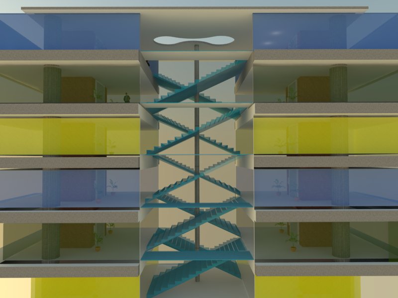
The 'Busifly Tower' located in the centre of the Sydney CBD was designed specifically to conform to the physical and social restraints of the site. A great deal of thought had been implemented into the design process of the building, from the simple things like choosing the colour of the stairs to the interaction of the interior to the exterior. This dominating centralisation of the circulation system in the projects of Lippmann Partnership, an architectural firm based in Sydney, partially influenced the centralised (vs. segregated) circulation route of the tower, particular the Butterfly House in Dover Heights. As a typical business building whereby the activities going on inside are not to be seen by the general public, this significantly contributes to the reinvented architecture. The stairs begin on the 8th floor where there are less people, as all the office spaces are on the bottom levels. The people on the bottom levels will probably be the main users of the lifts as there are more people who need to go either up or down in groups. The lack of stairs also minimises the sound coming from people travelling up and down the stairs. The slightly opaque coloured ribbon windows allow for an interesting effect on the suns rays as it travels into the building and also appeals to the public.

__________________________________________________________________

'CIRCULATION' page


CIRCULATION
The simple yet thoughtful circulation design system of the building can clearly be assessed from the inside of the building. There are two distinct lifts clad in red stone which travel from the ground floor up to the highest floor, which the addition of several staircases running between each level from the 8th floor up.
To meet the requirements of the main users of the building, business employers who need to travel up to a particular floor in as shorter time as possible. The lifts are the perfect solution, but as soon as they have reached that floor and decide they need to go up or down one floor, they have the option of tkaing the stairs rather than waiting for the elevator which most probably will be used by the people who only entered the building.

__________________________________________________________________

'VISUALISATION' page

Sunday 23 October 2011

Final Presentation


Link to final Interactive PDF is here.

Link to the final Print PDF is here.


PRINT versions of the PDF:

Page 1

Page 2

Page 3


Week 13

500 word draft:
The ‘Busifly Tower’ located in the centre of the Sydney CBD is designed specifically to conform to the physical and social restraints of the site. A great deal of thought had been implemented into the design process of the building, from the simple things like choosing the colour of the stairs to the interaction of the interior to the exterior. This dominating centralisation of the circulation system in the projects of Lippmann Partnership, an architectural firm based in Sydney, partially influenced the centralised (vs. segregated) circulation route of the tower, particular the                                  
In the ‘Busifly Tower’, elevators run from the bottom up and additional sets of staircases run from the ground floor to the 12 floor, distinctively partitioning the building. This is more suitable for a business building where people rush to get to a particular side of the tower or if they need to get to one level above or below without having to wait for the lift. Concrete slabs between each level contrast to the coloured glass in terms of the material used. Inspiration was drawn from the butterfly house in Dover Heights for this idea and the Macquarie Bank building in King St wharf.The circulation system of the ‘Busifly Tower‘ seems simplistic compared to the design of other elements of the building, but in fact, the circulation system was drawn out before the actual spacing of the offices in the tower. Drawing from the circulation system of the "butterfly house" the idea of a centralised circulation trajectory which is only demonstrated in the top half of the building. My team and I decided to diverge the elevators from the centre, also allowing it to act as a structural member. The first step of the design process was planning the circulation system. The design of the actual office spaces came second. As a typical business building whereby the activities going on inside are not to be seen by the general public, this significantly contributes to the reinvented architecture.  The stairs begin on the 8th floor where there are less people, as all the office spaces are on the bottom levels. The people on the bottom levels will probably be the main users of the lifts as there are more people who need to go either up or down in groups. The lack of stairs also minimises the sound coming from people travelling up and down the stairs. The slightly opaque coloured ribbon windows allow for an interesting effect on the suns rays as it travels into the building and also appeals to the

Sunday 9 October 2011

Week 11 Draft Renders


Background Image taken by me


Background image courtesy of:  http://imageshack.us/f/13/p2230191.jpg/


s

Initial Sketches 

Circulation Diagram


Sunday 25 September 2011

Week 10

Montage of textures and ideas for my 'Busifly Skyscraper'


-----------

3rd format: WEBSITE


Since Lippmann Partnership hasn’t published their own book on their projects, most of the information I found in regards to their past, present and future projects were found through online sources. Most of the information gathered of the ‘Butterfly House’ originated from Real Estate websites (2)and their own Lippmann Partnership Website(1) . Secondary online resources are the top priority for users who simply seek a quick rundown of main points, contact details, photos and the like. The ease of navigation within the website makes the information easily accessed by the public and can be viewed from anywhere in the world. The prevalence of technology with the turn of the century denotes that a majority of people will search for something on the internet before resorting to other sources of information. Lippmann’s website layout consists of a simple navigation bar (3) at the top of the window which link to Lippmann’s various projects and when selected, opens up a new page with a large slideshow of images displaying sketches, final plans, renders and final photographs of their project. The minimalist approach to the design layout makes it easier for the users to browse the site and gives a big picture of the eloquence of their designs.

                The reason behind my decision to present my third output as a website is simple.  It is currently the most convenient way for everyday people to immediately find information at a click of a button. No need for fancy programs or money, and as I said previously, can be accessed from anywhere. The benefits of this third format will allow me to incorporate my basic web design skills to create something similar to the current Lippmann website. I will present the draft as still shots of the website, but for my final presentation I will present it from my laptop as I can’t find any free servers to run my website off.
1

2

3
 

-------------------

Grid layout for 3 A1 Posters

Page 1

Page 2

Page 3